Showcasing your school and sponsors through the ScoreVision display can hold great potential–if designed properly. This article contains several methods to perfect your board design for maximum appeal and engagement.
It is important to make careful considerations to the message and the images you choose; good ideas are what make advertising so impactful. The first and most important thing you must remember is that there are several different types of advertising. No two types of media are the same; therefore, not all types of advertising should be created the same.
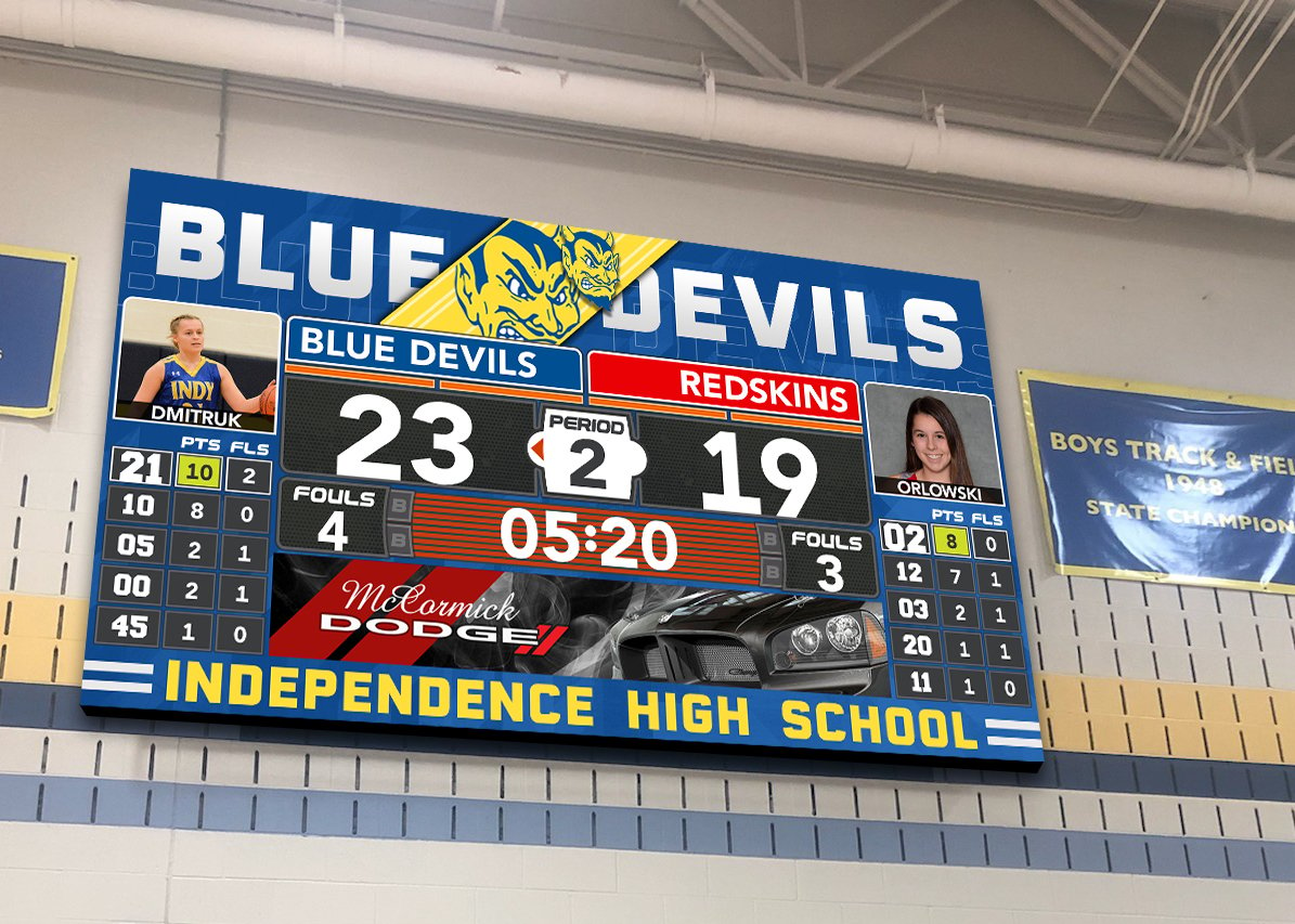
"What is design? A plan for arranging elements in such a way as to best accomplish a particular purpose." - Charles Eames
The purpose of two-dimensional design is visual communication. A design is created with elements - line, shape, color, value and texture - that are put together using principles - unity, variety, emphasis, balance and scale. Although design can be divided into elements and principles for the sake of discussion, it is only when these elements and principles work together to form a whole that a design is considered successful.
Design, like writing, involves problem solving, planning and organizing. In verbal communication, we choose which words to use and how to put them together to best communicate our thoughts and ideas. In visual communication we choose which elements to use and how to put them together to best communicate our thoughts and ideas. We would not randomly throw words and punctuation on a page and expect them to communicate. Shouldn't we do the same with images?
DESIGN 101
Here is a brief overview of how to create beautiful and engaging designs.
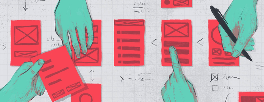
Keep It Simple
Keep any phrases simple and to the point by focusing on impactful visuals, colors, or words themselves. Use a single photographed element for visual impact, or even text by itself can become a smart design tool. With few words, you can let typography and language become a key element in your design. Think about famous campaigns that ran on an iconic type face and phrase, such as “Got Milk?”; the ad is simply known for its white font on a black background and the two words asking a simple yet intriguing question. It generated conversation and action, and just from two simple words. This type of design is also effective on ScoreVision’s boards: it’s clear, easy to read from near and far, and most importantly, easy to remember.
Use High Quality Images and Logos Only
High-resolution content, well-lit photography, and professional illustrations should be used to create the best looking graphics possible.
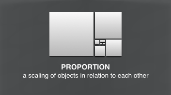
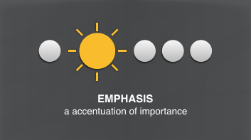
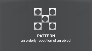
Use The Principles of Design
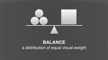
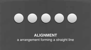
The principles of design describe the ways that artists use the elements of art (line, shape, color, value and texture) in a design. On the next page is an overview of the principles of design.

DESIGN TIPS
Design is an opportunity to tell a story to your audience. We’ve listed below several specific tips and techniques that can be used to ensure that your message and design are brought to life and are presented in the most engaging and effective way.
1. Make the Text Large: Designs on an LED multimedia board should be simple, clear and easy to read since most viewers are seeing the content from a distance of 50 feet or more.
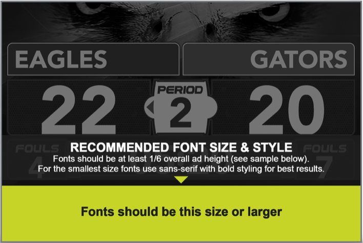
2. Use Bold, Non-Serif Fonts: Always use large, legible typefaces. At 100 feet, thin lines optically fade or break up. Avoid decorative, italic, or serif fonts. As a general rule, upper and lower case sans serif fonts provide the best readability. Minimum text height should be 3" with a non-serif, bolder-style font. That’s about 1/6 the height of a Panorama ad. The larger the font size, the less bold the characters have to be. Attached is a graphic that helps explain and illustrate this.
3. Stick to One Message or Idea : Simplify everything. Don’t present a complex message or numerous images. Have one thing that you want your audience to do or to recognize. The best outdoor media reduces a complex message to it’s essential elements.
4. Be Short and Sweet : Use no more than ten words total on an entire slide – and that includes the logo/product tagline. We recommend seven words or less for the headline. Keep the words short for faster comprehension.
5. Avoid White Backgrounds: To achieve white on and LED board, a combination of all three color bulbs must be turned on to their maximum brightness. Consequently, white backgrounds will wash out and compete with the remainder of your creative. In order to create the effect of a white background, it is best to use an off-white, light gray or cream colored background.
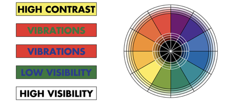
6. Use Bright, Bold Colors : Stick with fully saturated web-safe hues. Complimentary colors, such as red and green, are not legible together because they have similar value. Contrasting color combinations work best for viewing LED designs at far distances.
7. Design With High Contrast: Being subtle does not work at great distances. Strong contrast in both hue and value are essential for creating good digital out-of-home.
8. Pick Your Image Wisely : Take a small object and make it large (like a watch) rather than a large object small (like a building). Avoid using landscapes or complex scenes. We recommend three visual elements or less, total. For example: one image, one logo and one headline.
9. Test Your Idea: A billboard is not a print ad; the average viewing time is only about 5 seconds. A good test is to show the design to someone from a distance for only 5 seconds and then ask them about it. Did they understand it? Who was the advertiser? What do they think the advertiser wants them to do?
10. Hierarchy: Visual hierarchy refers to the arrangement or presentation of elements in a way that implies importance. In other words, visual hierarchy influences the order in which the human eye perceives what it sees. This order is created by the visual contrast between forms in a field of perception.
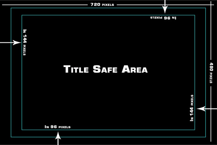
11. Title Safe Area : Simplify The title-safe area is a rectangular area which is far enough in from the four edges, such that text or graphics show neatly: with a margin and without distortion.
COLOR TIPS
Reproduced below are 18 color combinations tested for visibility at various distances by the OAAA. Visibility is ranked in the sequence shown, with 1 the most visible and 18 the least visible.
The color wheel and colored bars, also below, illustrate the need for designers to choose colors for outdoor that are complementary but have a high contrast in value. For example, green and red are opposite each other and are therefore complementary colors. They represent a good contrast in hues, but in values they are very similar. The result sets up an annoying vibration. The same is true of blue and orange. Look at the design from 15 feet away for only 5 seconds. Can you understand it? This simulates driving past a billboard.
PHOTOGRAPHY TIPS
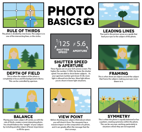
Whether you are a beginner or more experienced with photography, here are some tips that you will benefit from and give you better results.
Sizes
With the quality of digital and phone cameras these days, there is no problem capturing high quality photos. Even photos taken at 3 megapixels or larger are more than sufficient for the LED displays. The key is to size and crop to the aspect ratio consistent with the placements on your display.
For example, if you want to use the photo to fill a “cinema” area on the display, you’ll want to size and/or crop the photo to 1920 x 1080 pixels. In many cases, 1280 x 720 will deliver the same quality image on the LED display as the larger one since most LED display resolutions are even less than that. Keeping your images, however, larger than the native resolution of your LED display helps to ensure that your images are coming across as crisp and clean as possible.
If you would like to fill the entire screen with an image from a photo — something we call a “vista” sized image — you first need to know the aspect ratio and resolution of the display as a whole. The oW2619-Y100, for example, has a native resolution of 768 x 576 pixels. We recommend that artwork and photos used for vista purposes be created and/or cropped to the larger proportional size of 1440 x 1080 pixels, again to ensure that original image starts out at a better quality than necessary so that the final image being displayed is maximum quality.
Colors
Colors on the LED screen’s are very bright and vibrant, take advantage and capture photos with deep, rich color.
Treatments
- Avoid white backgrounds. White backgrounds use significantly more power than other colors and can affect the performance of the display.
- Contract helps create depth
- Avoid overly-complex photos. Make sure the subject is clear and crisp. Take into consideration where text or titles may be displayed over photos.
- Play with different angles.
VIDEOGRAPHY TIPS
From helpful tips for shooting better video and recording great audio, our videography tips will give you the jump start you need to begin.
Sizes
In general, 16:9 aspect ratio for video works best. Final videos can be composited at 1080p, but reducing the size to 720p will yield just as quality results with file weights being less than half, thus being faster to upload and process.
Treatments & Color
- LED boards render vibrant color and clarity. Make sure to take advantage with rich tones and contrast.
- Avoid white backgrounds because it uses more power and can affect performance.
- Take advantage of shadowing and outlines to create depth.
Frame Rates
Frame rates of 24, 29.97(30), or 59.98(60) work best. However, any frame rate should display correctly. For slow motion video, record at a higher rate (60 fps or faster) and then use a video editing tool, such as Adobe Premiere, to slow the footage to 29.97(30 fps).
Duration
Video clips for ad sequences are generally 15 seconds long. Other videos and animations can be any length, but should remain less than 100MB in over all weight for the most efficient upload and processing.
Strategically, your videos should be designed to fit into the pace of your production at the event – game play pace, the schedule of content and stage of the game/event may dictate the available time.
AUDIO TIPS
Audio recording is often an afterthought to videographers, but it's just as important to your finished product as the recorded video. Good audio recording takes a little bit of effort, but it's well worth it. Keep these tips in mind when audio recording.
Audio Quality
The best way to ensure that you have quality audio being delivered to your audiences, you need to start by capturing clean, noise-free audio. However, most audio editors have special noise-reduction features that can help eliminate some of the noise and distortions. Search Google for terms like “Noise Reduction”, “Remove Grain”, “Noise Print” in regards to audio and the editor you use. This will help you receive pertinent instructions on reducing noise and improving the quality of your audio tracks.
Volume Levels
75 decibels is the standard level for normal talking. Most audio editing programs take this into consideration with their audio leveling tools. Level 0 in these programs is the equivalent of 75 decibels. Setting all of your videos and audio clips at zero (0) will ensure your clips have a natural volume. More importantly, maintaining consistent audio levels between all your clips will keep consistent output at your events so various clips don’t change in volume and annoy the audience.
If you wish to raise the volume level of your audio in certain areas to achieve a more dramatic effect, try to limit the plus side to 3 in order to keep your track from getting distorted.
UNDERSTANDING FILE FORMATS
Acceptable File Formats & Compression Specs
JPG : JPG (or JPEG) is a raster image that is often used for photographs. JPGs can be optimized, when saving them out of photoshop, to find the perfect balance of small file size and high quality. For best practice, you want your image files to be as small as possible so they will upload and process quickly, but large enough so that the imagery appears clear, not pixellated or blurry. A JPG does not support a transparent background, so they are always in the shape of a rectangle or square with a solid backdrop.
Most still images used in the ScoreVision system – like Brand Wrappers, Brand Backgrounds, and ad banners – are saved in this file format.
PNG : PNG is another raster image type. The primary benefit of a PNG over a JPG is that a PNG supports transparency…but a PNG is generally larger in its file weight than a comparably-sized JPG.
MP4 : A file with the MP4 file extension is an abbreviation for an MPEG-4 Video file, which is a compressed file format that can contains video and audio. MP4 files are usually seen when you download a video from the internet or use a DVD ripping program to save a DVD to your computer.
For best compatibility and results in the ScoreVision system, use the MP4 file format for animations and video clips.
File Export Guidelines
After creating your artwork or video in an editing program, you will need to export it to one of the file formats noted on the previous page in order for it to be utilized properly by the ScoreVision system. Below are basic instructions on how to do this for the Adobe suite of editing programs. If you use an editor other than what’s noted below, please refer to the instructions that were included with your program or check online.
Adobe Photoshop: To export a file from Photoshop, select “File”, then “Export", then "Export As”. This will spawn a modal that will allow you to select a file type (JPG, PNG, or GIF) and its quality. Recommended settings are JPG at 90% quality. This provides a final file with very good compression and image quality with little compromise. Click “Export All” and then choose the file name and location. Click “Export”!
Adobe After Effects: To export from After Effects, select “File", then “Export”, then “Add to Adobe Media Encoder Queue”. This will transfer the file to Adobe’s Media Encoder program where you can export. Make sure the format is set to H.264 and adjust the name and output location. Click “Start” to execute the export process.
Adobe Premiere Pro: To export from Premiere Pro, select “File”, then “Export”, then “Media”. Make sure the format is set to H.264 and click “Queue”. This will transfer the file to Adobe’s Media Encoder program where you can export. Make sure the format is set to H.264 and adjust the name and output location. Click “Start” to execute the export process.
Naming Conventions
You should be consistent and descriptive in naming and organizing files so that it is obvious where to find specific data and what the files contain. You might consider including some of the following information in your file names, but you can include any information that will allow you to distinguish your files from one another: project title, a date, advertiser name (if applicable), school name (if applicable), or any other unique identifier.
Do not use spaces. Some software will not recognize file names with spaces, and file names with spaces must be enclosed in quotes when using the command line. Other options include: underscores, dashes, no separation at all, or camel case (where the first letter of each section of text is capitalized).
An example of a good file name would be “Advertiser-School-AdType-Date.jpg” or “BuffaloWildWings-WestsideHS-PanoramaAd-0917.jpg”
Rastor vs Vector Image
Raster Images use many colored pixels or individual building blocks to form a complete image. JPEGs, GIFs and PNGs are common raster image types. Almost all of the photos found on the web and in print catalogs are raster images.
Because raster images are constructed using a fixed number of colored pixels, they can’t be dramatically resized without compromising their resolution. When stretched to fit a space they weren’t designed to fill, their pixels become visibly grainy and the image distorts. This is why altered photos may appear pixilated or low resolution. Therefore, it is important that you save raster files at precisely the dimensions needed to eliminate possible complications.
Vector Images, alternatively, allow for more flexibility. Constructed using mathematical formulas rather than individual colored blocks, vector file types such as EPS, AI and PDF* are excellent for creating graphics that frequently require resizing. Your company logo and brand graphics should be created as a vector and saved as a master file so you can use it with smaller items such as your business card and letterhead, but also on larger surfaces, such as your corporate jet. When necessary, always create a JPG or PNG for use on the web from this master vector file. Just be sure to save the new raster file in the exact dimensions needed.
*A PDF is generally a vector file. However, depending how a PDF is originally created, it can be either a vector or a raster file. Whether you opt to flatten the layers of your file or choose to retain each one will determine the image type.
